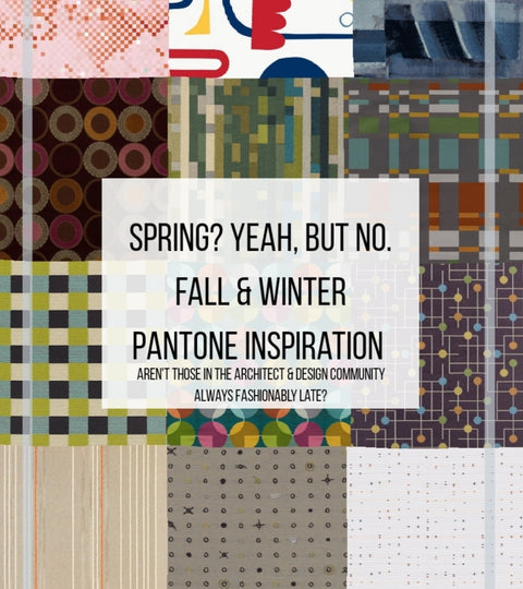
Why launch a Spring Collection in fall you ask? Well, why not? Can you say, “fashionably late”?
When you are learning new things you don’t know, time can go by rather quickly. Thankfully for us, when we conceptualized the Spring Closeout and Spring Collections, we took Pantones New York & London's Fall, & Winter colors into consideration when selecting fabrics. Though we initially conceptualized our products in Spring and even named the collections Spring, they are made to go through the seasons. Let’s be honest, we change our décor with the seasons, right? It always takes textiles about a year to get through circulation anyway. We change our décor based off of what’s trendy. What we like. We launch when we can.
For instance Pantones London Fashion Week for Fall/Winter 2020 as stated by Leatrice Eisemen stated, “The color story for Autumn/Winter 2019/2020 suggests rich tones, each capable of making a statement but also with a versatility that creates warmth and harmony when paired together,”. Being Executive Director of the Pantone Color Institute, that lady knows her colors. “A sophisticated, yet bold collection of colors, this season's palette exudes confidence and empowerment.”
That got us thinking. How can we utilize these amazing colors in our products while staying aggressive in price? While still allowing our customers a choice because none of us, EVER like things the way they are. Well, what if we were able to stay true to our retro taste, price products aggressively, treat customers like royalty by allowing them endless choices of customization? Viola! Retro Attractive Decurban was born!
We scoured the earth and found the coolest fabrics that spoke to our retro yet frugale souls. We bought and negotiated all of these remnants we possibly could, and mixed and match fabrics to create some kick arse pillow covers! We are getting started with just the covers but we plan on growing into other luxurious products. Now, just because we are amazing at locating these items, procuring them, and selling them face to face doesn’t mean we are exactly the best at selling them virtually. Hey, we are working on it. Rome wasn’t built in a day ya know.
Anyway, back to Pantones London Fashion week that discusses, “Autumn/winter 2019/2020 colors reflect a new level of color complexity; sophisticated and strong; a meaningful palette of color that empowers and instills confidence. Displaying endlessly varied combinations, color stories exhibit a mix of nuances, creating the feeling of freedom to create one’s own personalized identity”. Published for the fashion industry by the Pantone Color Institute, this season’s report features the top 12 stand-out colors, as well as current takes on the four classic neutrals we can expect to see from fashion designers on the runway as they introduce their new autumn/winter collections.
Those colors are as follows:
BOLD - A nuanced palette for Autumn/Winter 2019/2020 reflects a new level of color complexity; one that lends itself to endlessly varied combinations.
- PANTONE 17-1545 | Cranberry | Cranberry is a vital red that adds a pungent punch to the palette.
- PANTONE 19-1534 | Merlot | A fortifying wine shade, Merlot displays sophistication and depth.
- PANTONE 17-1450 | Summer Fig | Rich in flavor, Summer Fig infuses a touch of exoticism to the fall palette.
- PANTONE 16-1532 | Crabapple | Bringing warmth and comfort, orangey- rose Crabapple looks as though it were baked by the sun.
- PANTONE 19-1419 | Chicory Coffee | Robust and tasteful Chicory Coffee introduces an element of heartiness.
- PANTONE 18-4217 | Bluestone | Bluestone is a color of quiet resolve.
- PANTONE 19-4055 | Galaxy Blue | A thoughtful blue hue, Galaxy Blue is evocative of the greater galaxy.
- PANTONE 16-0840 | Antique Moss | An arresting yellow-based green Antique Moss displays sharp contrast to the autumn/winter color palette.
- PANTONE 19-5230 | Forest Biome | Forest Biome is a foresty green shade suggestive of the color of autumn flora.
- PANTONE 17-1143 | Hazel | A mellow brown, Hazel is thought of as an organic natural tone.
- PANTONE 15-1147 | Butterscotch | Butterscotch is a deliciously appealing golden yellow.
- PANTONE 18-3211 | Grapeade | The distinctive Grapeade is a notable muted mauve tone.
NEUTRAL - Serving as a foundation, a range of seasonal staples that can stand alone or act as a contrast for individualized color mixes.
- PANTONE 12-0806 | Rutabaga | Rutabaga is a basic beige both rooted and timeless.
- PANTONE 17-0535 | Green Olive | A definitive olive, Green Olive sets the standard for green.
- PANTONE 19-3815 | Evening Blue | Confident and classic, a deep blue symbolic of the evening sky.
- PANTONE 17-0000 | Frost Gray | An eternal gray shade, Frost Gray conveys gravitas and stability.
That’s just London. New York’s color picks are just as attractive. New York Fashion Week Pantone colors for autumn/winter 2019/20 reflect an emergence of confidence; bold and strong, a visceral palette of colors that are relatable yet display some clever tweaks for the winter season. Expressing our wide-ranging acceptance of color, combinations for Autumn/Winter 2019/2020 suggest a thirst for liberation and a desire to realize our own individualized unique identities. “Colors for Autumn/Winter 2019-2020 range from easy and sophisticated to strikingly different and unique,” said Leatrice Eiseman, Executive Director of the Pantone Color Institute. “This palette of versatile hues builds a sense of empowerment and confidence, enabling the wearer to choose the colors that best reflect his or her mood and persona.”
Our personas may not change but our moods do, so do our tastes. They also have 12 bold colors and 4 neutrals which are as follows.
BOLDS- Visceral hues coupled with seasonal core shades create a versatile palette inclusive of the following:
- PANTONE 19-1557 | Chili Pepper | A spicy red, Chili Pepper adds drama and excitement as it stimulates the senses.
- PANTONE 19-1650 | Biking Red | An adventurous deep red, Biking Red is strong and powerful.
- PANTONE 12-1110 | Crème de Pêche | An embracing light peach, Crème de Pêche speaks of softness and ease.
- PANTONE 15-1530 | Peach Pink | Warm and flattering, Peach Pink imparts a healthy glow.
- PANTONE 19-1234 | Rocky Road | Rocky Road is an earthy and grounded solid brown.
- PANTONE 17-1926 | Fruit Dove | An extroverted pink, Fruit Dove creates a presence that can’t be ignored.
- PANTONE 18-1155 | Sugar Almond | An appetizing mid-tone, Sugar Almond is a sweetened shade of brown.
- PANTONE 15-1150 | Dark Cheddar | Bold and daring, Dark Cheddar is a sharp blend of yellow and orange.
- PANTONE 19-4055 | Galaxy Blue | A thoughtful blue hue, Galaxy Blue is evocative of the greater galaxy.
- PANTONE 18-4217 | Bluestone | Bluestone is a color of quiet resolve.
- PANTONE 16-1358 | Orange Tiger | Orange Tiger imparts a fearless energy.
- PANTONE 19-6050 | Eden | Eden is a stately forest green that plays on tradition.
NEUTRALS- This season’s core shades are strong enough to stand alone or work equally well as a foundation for distinguishing color contrasts.
- PANTONE 12-0815 | Vanilla Custard | Vanilla Custard is an understated, smooth and creamy white.
- PANTONE 19-3815 | Evening Blue | Confident and classic, a deep blue symbolic of the evening sky.
- PANTONE 16-0000 | Paloma | An unpretentious, yet at the same time elegant gray, Paloma endures.
- PANTONE 17-0530 | Guacamole | A tasteful, nutrient-enriched green, Guacamole establishes a refreshing foundation.
Our product descriptions describe which Pantone colors inspired the fabric selections to help you gauge whether they will go with your décor or palette schemes. The Spring Closeout line has launched already which includes, The Games & Geometry Collection” and the “The Neutral Collection”. The Games & Geometry Collection consists of 6 designs that brings style to gamers, nerds, or mathematicians couches anywhere. Bold color, patterned fronts with soft, huggable backs allow you to hug these pillows with style whether playing games or solving complex problems. Being stain, soil, and spill proof makes buying these a no brainer.
The Spring Collection is almost done being procrastinated about and launched but who knows. We are still playing with photos, content, descriptions, and variants. Fun times. You would think that we would have had enough sense to pay a professional to take these photos for us, but we didn’t. Lesson learned. DOH! Now we become the best photographers we can and figure this out ourselves.
If after learning about Pantones Fall & Winter colors and you want more knowledge about how colors work or their terminology check out our blog post, "Understanding Color | The How To Select Finishes That Work Well Together Guide For Dudes or Non-Designers". If you already know colors and color schemes then you have to be curious about the best way to maintain your fabrics & upholstery. We wrote a piece dedicated to keeping fabric looking new and how to treat stains if and when they do happen. Check out our, "R.A.D. Guide For Fabric Care & Cleaning Codes"
Until next time our furniture, design, and architecture loving friends! Stay fashionable!
0 Comments
There are no comments yet. Be the first one to post one!